


What Colour of Curtains and Blinds Do You Choose?
Curtains composed a room. Mixed with a proper concept and theme, it can set-up different moods and settings. Choosing a curtain and blinds is like shopping for a new dress. Everything must be perfect.
Color is an important element in choosing a curtain. If your color is not blended well, it can ruin the design of a room. In selecting an appropriate color for your curtains and blinds, you must considered the right color scheme fitted that will complement with the room.
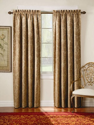 Image Source: http://cdn.overstock.com/
Want to have a soft look of the room? Just choose a color that matches the color scheme of the walls. This what you called monochromatic scheme. Just like on the image above, the curtains appear only as a background to highlight the design of the room.

Image Source: http://shop.indiatimes.com/

Image Source: http://www.lushome.com/
Opposite colors on color wheel can also be a good color combination. It also makes your curtain to stand-out and noticeable. Color blue is a cool color thus it must be combined with warm colors like yellow or red. Dark colors must be combined with light colors.

Image Source: http://www.mtyfurnishing.com/
As said above, colors are mood setters. Different colors symbolizes different emotions. If you want your room to appear refreshing and relaxing, you can choose the color green. A nature-inspired theme can be created to intensify more the mood.

Image Source: http://lindsaymillerinteriordesign.com/
If you want for more elegant appearance of your room, pick purple. This color symbolizes royalty. Simple room will became exquisite with its touch just like the room in the image.
 Image Source: http://farm5.staticflickr.com/
Brown is home. According to some psychologist, color brown conquers emotional distress while creating a safe haven for feeling on people. So if you want a comfortable aura, this is the color you’ve been looking for.
Aside from bedrooms, other parts of the house can be hanged up by curtains and blinds.

Image Source: http://cdn.homedit.com/
Curtains can also be placed in bathrooms. Its color beige, matches up with the color of the walls making it to look refined and delicate.

Image Source: http://www.hauhauz.com/
Orange is the color of excitement and enthusiastic. It is also seen in modern interior designs that orange is used as a color for curtain Singapore in dealing with kitchen or dining part of the house since it can enhance energy and uplift emotions.


You can also change the color of your blinds or curtains during different seasons. For example in winter, you can use warm color like brown or white. While, in summer time, you can use cooler color like green and blue.
Different curtains and roller blinds Singapore are available in the market locally and globally. It’s up to you on how you will use your creativity to unleash the utmost beauty of your house.